
Elevating Product Design through Motion
The value in UX Motion Design lies in the ability to bridge design disciplines and tell stories that aren’t bound to traditional formats and narratives.
Motion allows you to communicate meaning without words, sounds or well worn symbols.
Not only does it let you solve UX challenges more elegantly – it also breathes life and personality into products.
PROJECT
UX Motion Design Overview
CLIENT
Pizza Hut
T1 Investment Bank
MY ROLE
UX Motion Design
Illustration
Animation
How Motion Contributes To The UX
Motion with purpose helps customers navigate our products and tells a better brand story.
DELIGHT USERS
Brand Experience
Motion can turn a functional experience into a memorable interaction.
(2kb Lottie / 18kb JSON Animation)
EDUCATE USERS
Comprehension
Motion can provide context without requiring additional action/clicks.
(3kb Lottie / 11kb JSON Animation)
FOCUS USERS
Usability
Motion can capture attention and highlight key UI elements.
(3kb Lottie / 13kb JSON Animation)
SOLVING UX CHALLENGES WITH MOTION DESIGN
Layered Screen Below – Results & Success Metrics
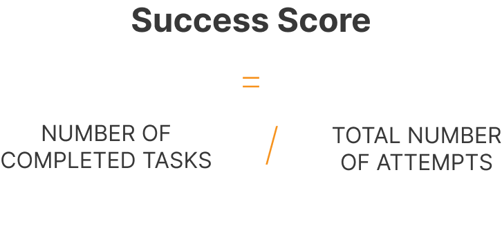
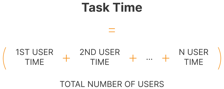
We ran Success Score (Task Completion Rate) & Task Time Research Sessions before and after the ux test based on users finding the “Account Charts” within the app.
To get our Success Score we calculated the number of completed tasks and divided it by the number of attempts.
Task time we measured how long it took a customer to find the “Account Charts” and obviously the shorter it takes, the better.
(NDA – exact metrics are not able to be shared)
Setting Expectations
Challenge:
Initially it was a hard cut (instant transition) which felt jarring.
Solution:
By visually representing current status and progress we are providing assurance and making our users aware and confident in the process of using our app.
Keeping users updated is essential.
STATE PROGRESSION FEEDBACK
UX SCREEN CHOREOGRAPHY
Empty States – Often overlooked in UX
These are the moments in a users experience where there is nothing to display for example: Searching for something in Gmail and getting no results.
These in-between moments provide opportunities to improve the customer experience and add brand personality.
UX EMPTY STATE
Empty State – Results & Success Metrics
As Empty States are often “dead-ends” in customer journeys, we measured our success based on the concept of Newton’s First Law: An object in motion stays in motion, but an object at rest will remain at rest. Our aim was to keep the flow.
Along with the new animation we included the text “We’re working on great new offers – check back soon.” And a “Back To Home” button.
- Customers are no longer confused by the empty state.
- Customers no longer come to an absolute halt – now an onward journey.
- The light-hearted animation built a better brand experience.
(Under NDA & exact metrics are not able to be shared)
ONBOARDING PROTOTYPE – FIGMA / AFTER EFFECTS / LOTTIE
SCALING LEVELS OF CUSTOMER SUCCESS ANIMATIONS
How much is too much motion?
Accessibility – With Great Power Comes Great Responsibility
Motion is by far the best way to capture attention, which is why it is so important to adhere to Accessibility Standards (W3C).
Ignoring these standards will quickly lead to poor usability, distracting content and ultimately losing customers.

QUICK TIPS:
Onboarding Flows – Auto-play animations under 5 seconds is ok, any longer becomes distracting and risky.
Parallax Animation on App and Web – Content animating vertically lends itself better to a natural scroll pattern whereas scrolling vertically with horizontal moving animation is deemed higher-risk.
Strobe Effect – Motion that flashes more than 3 times is considered non-compliant.
Safe Motion
Motion under 5 seconds
Show/Hide
Glowing
Colour Transitions
Slides
Scaling
Fading
High-Risk Motion
Longer than 5 seconds
Motion Effects:
Background Parallax
Object Parallax
Bouncing Effects
Fast Effects
Motion On Scroll:
Image Masking on Scroll
Full Width Mask on Scroll
Zoom on Scroll
Scale on Scroll
Rotate on Scroll
Non-Compliant
Longer than 5 seconds & no pause
Strobe Effects
Rotate on Scroll
Fast exit on Scroll
Horizontal Directional Scrolling
Uncluttered Menu
Challenge:
Too many icons with long names creating a cluttered menu.
Translating often requires even more space for titles.
Solution:
Lottie animated sliding navigation revealing the section title only on selection.
SIMPLE AND CLEAR MENU
BRAND GUIDELINES
Documenting – Brand Expression
Motion is more than ornamentation.
Motion design has a huge impact on the experience of digital products but if the UI animations don’t adhere to basic motion design principles, usability is undermined and things start to fall apart quickly.
Documenting principles and concepts of motion design, up-skills and keeps the team aligned. By creating Motion-Tokens allow engineering to scale with speed and consistency.
Motion Design Principles for Digital Products Include:
Easing, Offset and Delay, Parenting, Transformation, Value Change, Masking, Overlay, Cloning, Obscuration, Parallax, Dimensionality, Dolly and Zoom.
MOTION DESIGN VALUES:
Engaging. Keep the viewer interested without distracting them.
Purposeful. Tell a story and lead the viewer through it.
Clear. Present complex ideas in ways that are easily understood.
Delightful. Use animation with a spirit of playfulness.
Motion
Motion Design Values
Animation Principles
Logo
Brand Shapes
Bumpers
Transitions
text Animations
2D Animation
Product UI
Character Animation
Stop Motion Animation
Sound
Usage
Illustration
Style Principles
Purpose
Colour Palette
Objects
People
Logo
Blog Illustrations
Illustration Library
Icons
Icon Basics
Design Considerations
Icon Styles
Usage


Product Illustration
Product illustrations are used to add a human element to the user experience, and to communicate complex ideas in a simplified, attractive way.
LOTTIE / JSON ANIMATION
LOTTIE / JSON ANIMATION
LOTTIE 7kb / JSON 50kb
LOTTIE 9kb / JSON 59kb
LOTTIE 10kb / JSON 98kb
LOTTIE / JSON ANIMATION
My Role Included:
Motion Design Framework
UX Motion Design is a fairly new discipline which is why I’m creating a framework which democratises motion as a UX solution so everyone can start thinking in this way.
Starting with the user research and linking that feedback to potential motion design solutions.
A NEW WAY OF SOLVING UX CHALLENGES
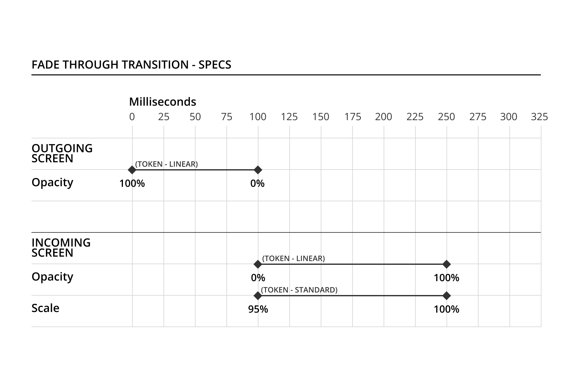
Documenting Screen Transitions
The best way ensure guidelines are implemented is to make them as simple and visual as possible.
TRANSITION – EXPAND (CONTAINER TRANSFORM)
TRANSITION – PUSH WITH PERSISTENT UI
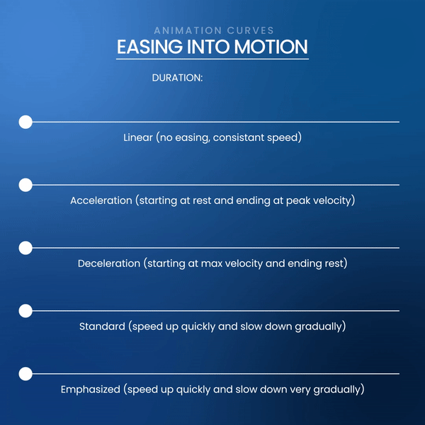
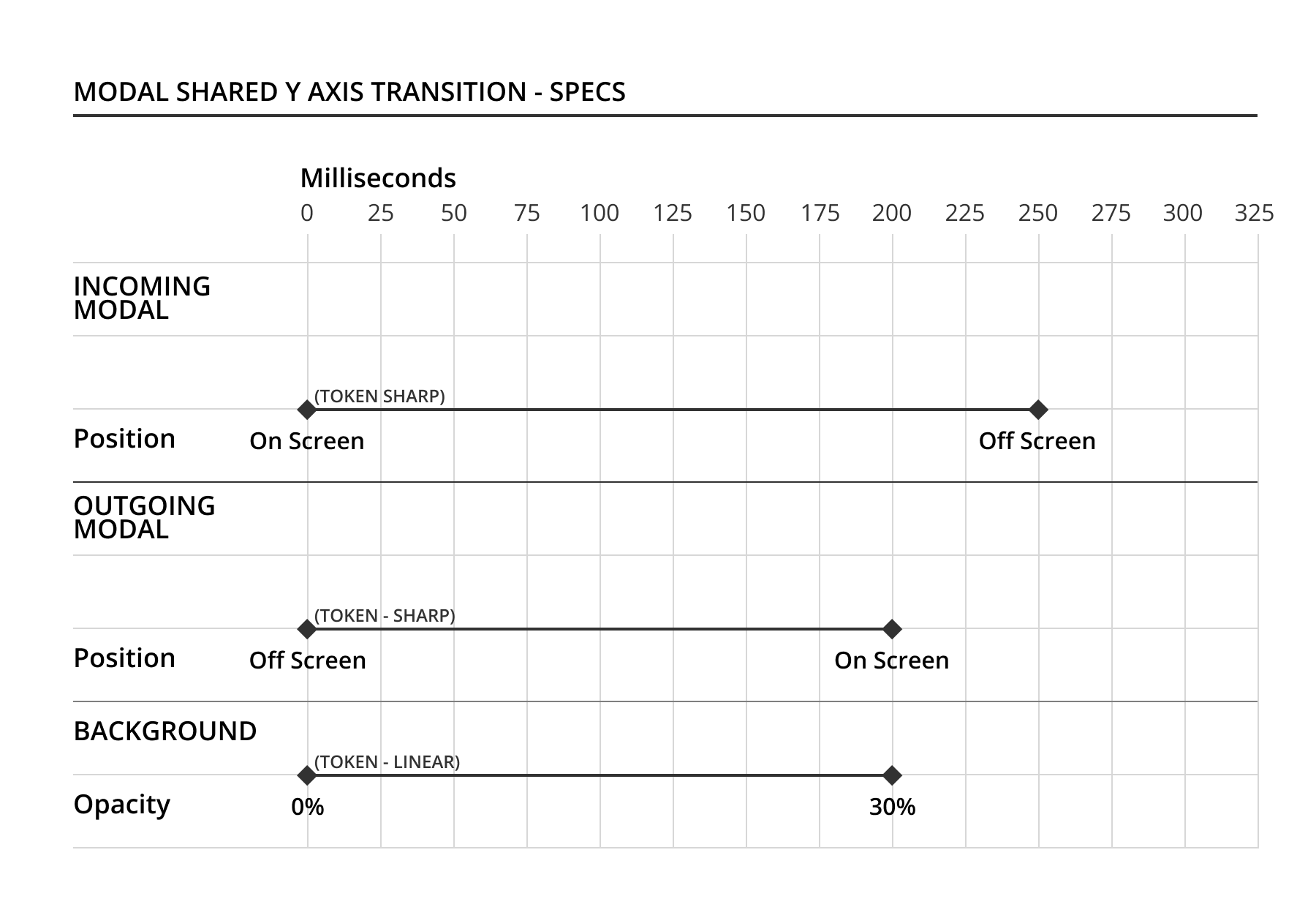
Easing and Speed
As in the real world – acceleration and deceleration help to make animations feel more natural. Rigid movement without easing can feel hard and clunky.
Typical app durations last between 200ms-300ms depending on the distance they need to travel, 300ms for full screen and 250ms or 200ms for shorter distances. These speedy times help the app feel more responsive.
The Linear animation in the demo shows the hard start and finish which feels unnatural.
The Acceleration which starts at rest and building up speed is used for UI elements animating off-screen where you don’t need to see the end of the animation. The opposite applies for the Deceleration, where the UI element starts off-screen decelerating to a softer stop on screen.
Standard and Emphasise easing curves are used for UI elements on-screen, with the latter emphasising the gradual slowing of the UI element to draw focus to it.
The best motion design systems combine common design best-practices with a distinctive brand point of view which makes them more unique to the products they are used for.
View my Brand and Marketing motion graphics portfolio.
Explainers, How Tos, Product Demos, Promotional & Social Ads