
Time to delight our users.
As consumers we see and interact with micro-interactions every day, often without recognising it.
Even though we’re not fully conscious of the micro animation at the time, often taking them for granted – it doesn’t mean they are not important, far from it actually.
These micro-interactions are what make customers feel good about themselves and feel good using our apps and websites – making user experiences more intuitive and engaging.
“I don’t know what it was about that app but it felt super slick”.
PROJECT
Multiple
CLIENT
Pizza Hut, YUM! Brands
MY ROLE
UX, UI, Concept Art, Illustration, Animation & Final Production.
Tools: After Effects, Lottie, Principle, Protopie, Figma & Adobe Animate..
PURPOSE & INTENT
Micro-Interactions are used to communicate meaningful feedback to the user.
When we perform an action we expect a confirmation animation to happen – clicking a button, scrolling a page or adding an item to the cart. The animations should always be used in a subtle way not to overwhelm the user. Functional animation with a purpose should always be a priority over visual animation for the sake of it.
These are the four parts to Micro-Interactions:
Trigger
The 2 types of triggers: user-initiated or system-initiated.
Either the user interacts to initiate an action or the system detects certain qualifications are met and initiates an action.
Rules
Rules determine what happens when a micro-interaction is triggered.
Feedback
Feedback updates the user - this could be anything the user sees, hears, or feels when a micro-interaction is happening.
Meta-Rules
This refers to what happens to a micro-animation when conditions change.
REQUIREMENTS
App Screen Loader
TRIGGER
System initiated.
CONSTRAINTS
The web-wrapper app could
take up to 4 seconds to load
on some older devices.
The animation is used to
disguise the loading lag-time,
creating a seamless experience.
ANIMATION
The swirl concept of the animation
is based on the spoon movements
when adding the tomato base to the pizza.
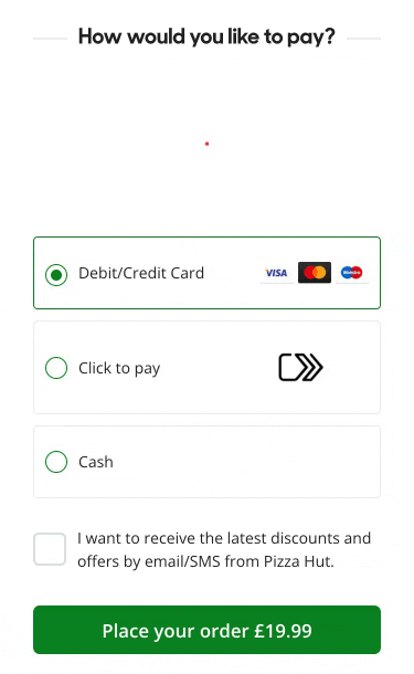
UX EXPERIMENT
Payment Animation
We ran this as an A/B test with and without the animation.
The intention was to bring more delight to the checkout section of the journey.
As fun as the animation is showing the customer how close they are to confirming payment & receiving their food delivery, the animation unfortunately proved to be more of a distraction.
We never ended up using this animation as it proves the point – functional animation with a purpose should always be a priority over visual animation for the sake of it.
LOOPED
UI Animations
These micro-animations strike the balance between fun and functional. These small motions tie together elements of an interface or design.
My job as a designer is to capture the users attention and guide them through a design, interface or graphic.
There are many strategies for building visual hierarchies – micro animations streamline this task and are useful for making static graphics feel alive.
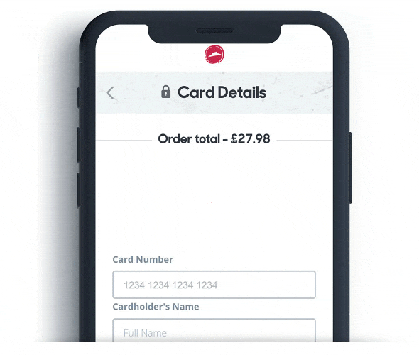
UX EXPERIMENT
WorldPay Animation
In ideal situations there was no lag-time, however on those rare occasions when there was a bad signal or the user had a low internet connection – WorldPay confirmation could take a few seconds.
Only in low-connectivity situations would we display this looped animation. It masked the issue, yet still provided the user with feedback that it was processing the transaction.
RESEARCH
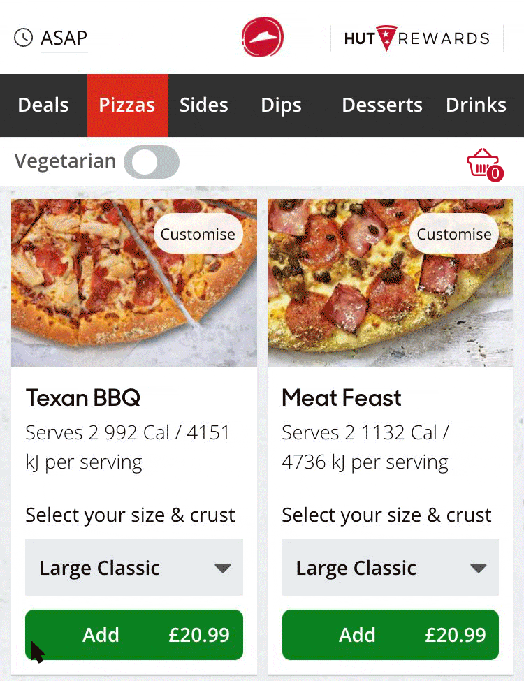
Add To Basket
This concept only reached prototype stage.
I was exploring ways of displaying a more visual confirmation for the customer to show that they had added the item to their basket. This animation provided the right amount of delight & feedback for the customer however it was a challenge to implement it in native code. We ended up only using the basket animation and removed the graphic animation “from button to basket”. Still very satisfying to add an item to basket.
UX EXPERIMENT
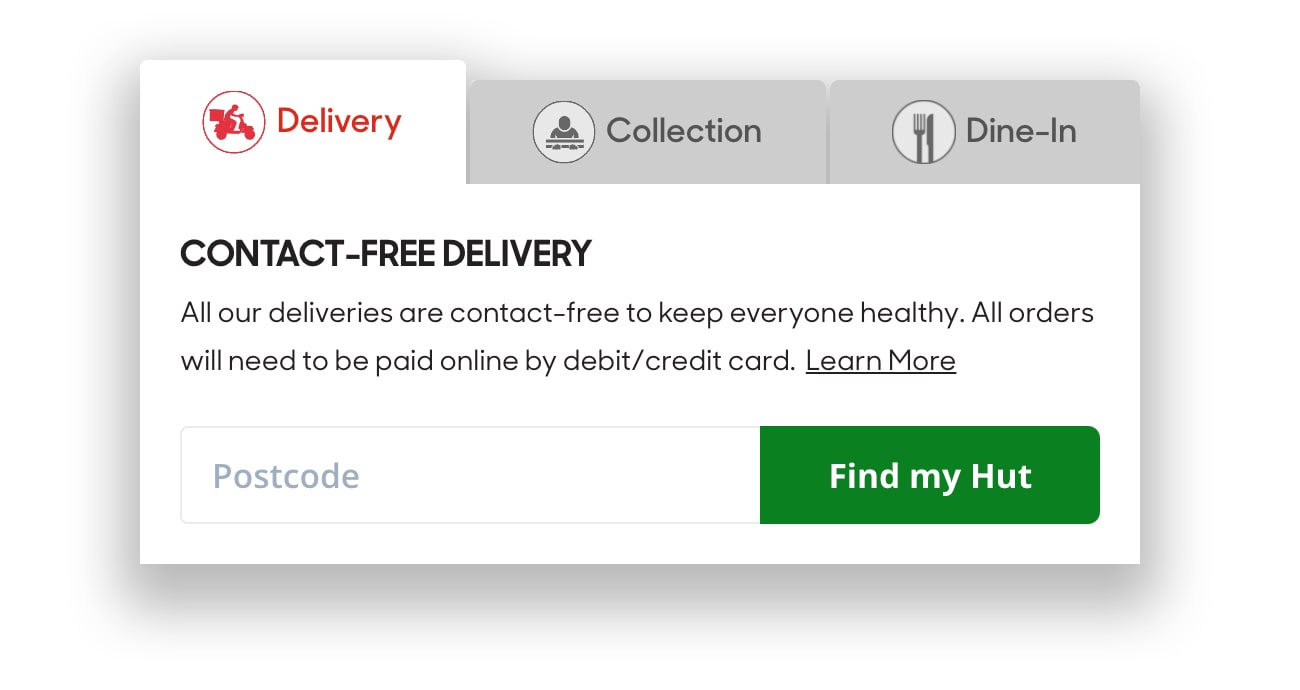
Localisation Animation
Based on which tab the customer has selected the relevant animation would loop adding subtle delight to the experience.
LOOPED
Order Tracker
Did you notice how the animation boxes below animated on when you reached this section of the screen?
This is another good example of how to use animation to make a design feel more polished.
I’ve added a 200 millisecond delay on each box so they load in a sequence.
Reload the page and take another look – it’s subtle yet feels great.
These animations were created to keep the customer updated on the progress of their order in real-time.
DEMO
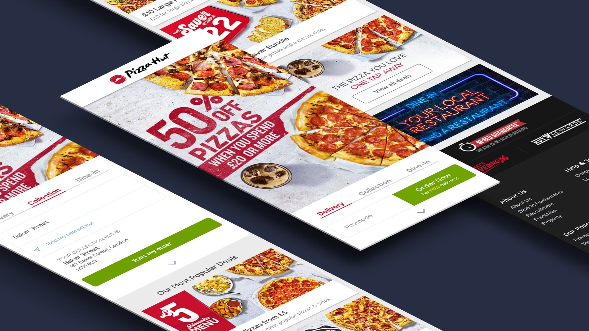
Animated Prototype
This is the Pizza Hut app homepage I redesigned, as part of the process I created an animated prototype to give engineers and stakeholders a better idea of the functionality.
- Animated pre-loader.
- Zoom out fade to introduce the interface.
- The parallax animation of the card overlapping the hero image.
- The subtle bouncing carrot to indicate more content.
- Another parallax animation when the user swipe gestures downward.
- Smooth animated ‘section select’ on the navigation.
- Card split animation to introduce toast notification.
MOTION DESIGN
Patterns and Guidelines
At Pizza Hut our app was a React web build which used a wrapper for IOS & Android, which meant our patterns and guidelines needed to be distinctly Pizza Hut yet universal. (Similar to Pinterest or Skype).
I created a library of animations and transitions which both delighted and educated users about functionality, patters and behaviour.
To get the desired effect I used anticipation, overlapping and exaggeration animation techniques. Everything obeyed the laws of physics to remain ‘believable’– however I exaggerated the anticipation phase and overlapping action – which gave each element a specific mass and weight with a bouncy personality.

MOTION DESIGN CONT.
Core Principles
Engaging and Delightful:
Pizza Hut needed to feel playful, fun and alive. I defined a set of consistent behaviours, timings and easing motions which led to an organic feel with physical properties that pop, bounce and wobble. This created a satisfying user friendly and fun experiences.
Purposeful and Clear:
With every animation there needs to be a reason behind the movement. Hinting towards interactions and illustrating mental models help the user find their way around. Directing attention or explaining a concept through motion helps avoid confusion and can also be used to distract or hide slow performance.
Universally Recognisable:
As the Pizza Hut app was web tech in a wrapper I didn’t need to align with native behaviours and experiences. I built the animations to compliment the native behaviours yet still feel uniquely Pizza Hut.
Easing Curve Library:
To ensure consistency of all animations I defined a library of basic moves and mental models that the engineers could replicate. These properties could then be used when applying simple moves to any UI element.